Personal project / 03
Track your favourite shows and get notified the moment a new season is confirmed, dated, or ready to stream, and exactly where to watch it.
Status system: live preview
Five states, each with its own icon and colour, not colour alone, so status reads correctly at a glance for every user, including those who can't distinguish it by hue.
The problem
This started from my own habit, not a formal research study. Shows are scattered across platforms, "renewed" news is usually just a rumour repeated across fan sites, and there's no single reliable place that tells you: is this actually confirmed, when's it landing, and where do I watch it. It didn't stay a hunch for long; see below.
Signal problem
Renewal news is noisy: rumour, leak and official confirmation all look identical scrolling a timeline. Users need those told apart, not blended together.
Trust problem
Where-to-watch information goes stale fast as licensing deals shift. A tracker that's wrong erodes trust faster than one that's simply incomplete.
Attention problem
A tracker only works if updates reach you: checking an app is a habit most people won't form on their own, which turned out to matter more than expected (see the feedback pivot below).
Research
Not primary user interviews. Desk research: published survey data on streaming behaviour, plus real reviews of the trackers people already use to solve this exact problem. Three findings kept coming up, and each one maps to a specific decision in Next Season.
Source: UserTesting / Talker Research
Source: Nielsen, State of Play
What the trackers people already use get wrong
"Wrong where-to-watch, often"
JustWatch reviewers report "where to watch" data being wrong often enough that some stop trusting it outright: reviews cite specific seasons still listed on platforms that dropped them long ago.
Source: JustWatch reviews, Trustpilot
→ Fix: a visible "Checked Xh ago" timestamp on every card, synced straight from TMDB rather than an opaque aggregator, so the source is shown, not just asserted.
"Still shows last year's season"
TV Time reviewers describe the app still listing a show at last year's season well after a new one aired: status information that's gone stale doesn't just fail to help, it actively misleads.
Source: TV Time reviews
→ Fix: five explicit statuses (renewed / airing / hiatus / rumored / ended) refreshed from live data, instead of one label that quietly falls out of date.
"It gets lost at the bottom of the list and I miss it"
A Trakt reviewer's exact complaint: without a way to surface what just changed, a new season landing looks no different from nothing happening. You only find out if you go looking for it.
Source: Trakt reviews
→ Fix: a dedicated Recent Updates feed first, then, once testing showed pull-only updates weren't enough, real push notifications by email.
Who this is for
Proto-personas built from the desk research above, not from primary interviews: there was no user testing on this project, so these describe behaviour patterns evidenced in the data and reviews, not real people I spoke to. Each one maps to one of the three problems above.
Has been burned by a tracker listing a show on a platform that dropped it months ago, so now double-checks everything manually, which defeats the point of using a tracker at all.
"I don't trust the app's answer until I've Googled it anyway."
Wants to know instantly whether "renewed" is real news or fan-site rumour, so they're not chasing a show that isn't actually coming back.
"Half the 'Season 5 confirmed' posts I see turn out to be someone's wishlist."
Wants to be told when something changes rather than remembering to go looking. A new season landing looks identical to nothing happening unless they check that exact week.
"If it's not in my inbox, it didn't happen as far as I'm concerned."
How this was built
I directed every product and UX decision (what to build, why, and exactly how it should look, feel and behave), then worked with Claude Code as my build partner to turn those decisions into real, working code rather than static mockups. That's a genuinely different loop from designing screens in Figma: every decision gets pressure-tested against real, running software the same day.
My job in that loop was direction, review and judgement: specifying what "confirmed" vs "rumoured" should mean and how to signal it, calling the accessibility audit and reviewing its fixes, catching the bugs that only showed up once real data replaced my mock data (see Resilience), and reprioritising the roadmap when testing exposed that updates were easy to miss.
Process
Built across three weeks of sessions rather than one continuous sprint. Each phase started by using what existed, finding what was wrong with it, and fixing that specifically rather than moving on.
31 Jul
3 Aug
4 Aug
18 Aug
The product
Three screens carry the whole loop: track a show, see what changed, add more without losing your place.
Dashboard: watchlist, recent updates, recommendations
Track your favourite shows and we'll tell you the moment a new season is confirmed, dated, or ready to stream, and exactly where to watch it.
Season 5 confirmed, final season · Nov 26, 2026 · In 3 months
Checked 2h ago
On hiatus between seasons: no Season 4 date yet
Checked 5h ago
Season 3 confirmed · Jan 15, 2027
Checked 1d ago
Because you're watching Severance
The Last of Us
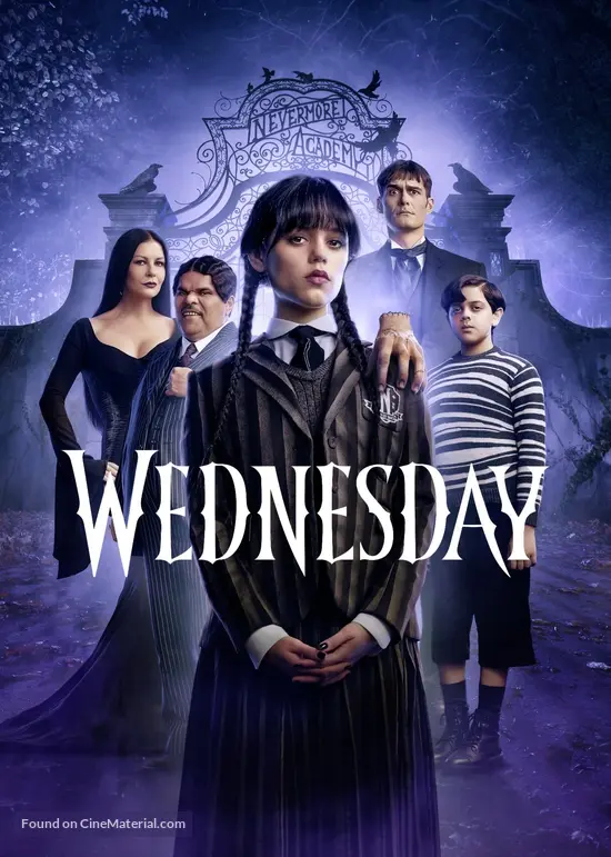
Wednesday
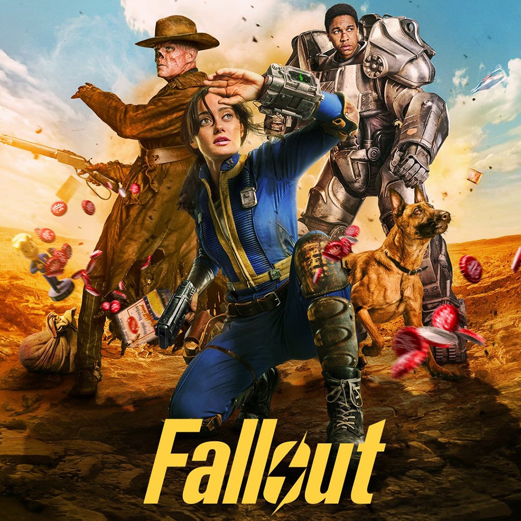
Fallout
Add a show: searches the loaded catalog and TMDB live

Fallout
Prime Video

Wednesday
Netflix
The Sopranos
HBO Max
Real dialog semantics, not a styled div: role="dialog", focus moves in on open and restores to the triggering button on close, and the page behind is marked inert while it's open, so a manual focus trap isn't needed, because inert content simply isn't reachable by Tab.
Sign in: passwordless, email magic-link
Sign in with your email to track shows and get notified.
Accessibility
Rather than eyeball the "Cinematic Indigo" palette and hope, I computed the actual contrast ratio for every text/background pair against WCAG AA (4.5:1 for normal text, 3:1 for large text and UI components), including alpha-composited badge backgrounds. Four pairs failed. Here's the fix, with the real before/after ratios.
Darkened, not lightened, on hover
The button's hover state (#4934f2) is darker than its resting fill (#705ff5), not lighter. That's a deliberate choice so hovering improves contrast instead of regressing it, which a naive "lighten on hover" pattern would have done here.
Beyond colour
The Add Show search field used focus:outline-none with nothing replacing it: invisible to sighted keyboard users, and to no one using a screen reader either, since there was simply no focus indicator to announce. Fixed with a visible accent-coloured focus ring.
Landmarks & structure
NavBar and main content use real <nav>/<main> landmarks instead of generic divs, so screen-reader users can jump straight to content.
Motion
The card fade-in animation respects prefers-reduced-motion and is skipped entirely for anyone who's set that preference.
Decorative vs. meaningful content
A poster's fallback initials are aria-hidden (redundant, confusing next to the real title read aloud), but the rating chip gets a real label, "Rating 8.6 out of 10", instead of a bare icon and number.
Dialog semantics
Add Show is a real dialog: role="dialog", aria-modal, a labelled search input, focus moved in on open and restored to the trigger on close.
Resilience
An 11-show test catalog is forgiving. A live ~100-show TMDB feed is not: swapping mock data for the real thing surfaced two failures that never showed up once in testing against the mock set.
Bug: recommendations vanished entirely
The "Because you're watching X" rows used a fixed similarity floor (0.25), calibrated against the small test catalog. TMDB only has ~16 genre categories total, so spread across ~100 real shows almost every genre is shared by far more shows than that floor implicitly assumed. Result on real data: every recommendation row disappeared.
Fix: derive the floor from the catalog itself: the weight of whichever genre is most common sets the bar a match has to beat, scaling automatically whether the catalog has 10 shows or 500.
Design decision: fail partial, not total
This sandbox can't reach TMDB to verify the real platform's function timeout, so rather than risk an uncontrolled timeout returning nothing, the catalog fetch carries its own 8-second time budget and bails out gracefully, returning whatever real shows it already has rather than failing the whole page. If TMDB is unreachable at all, or no API key is set, the app falls back to the mock catalog silently rather than crashing.
Why this matters for a real service
Mock data is convenient precisely because it hides the failure modes real data has: uneven distributions, rate limits, timeouts, missing fields. Treating "works on my test data" as done is how services ship broken to production. The fix here wasn't cosmetic, it was catching that the feature had silently stopped working at all.
Iterating on feedback
Using the product for real, not just building it, surfaced the actual priority: a tracker that only tells you something when you remember to open it isn't solving the problem it exists to solve. That reprioritised the whole next phase.
Before
Updates only appeared in the dashboard's "Recent updates" feed, visible only if you opened the app after a change happened.
Built
Real accounts (magic-link auth, Supabase, row-level security) so a watchlist persists and syncs across devices: the precondition for reaching someone who isn't looking at the app right now.
Closed the loop
A daily Vercel Cron job reruns the exact same change-detection logic the dashboard uses, for every user, and emails anyone with a real change: a branded template via Resend and react-email, not a generic transactional email.
Architecture
Data & privacy
Three tables (watchlist_items, show_snapshots, user_state), each scoped by Postgres row-level security so a signed-in user's queries can only ever touch their own rows. Privacy by construction, not by convention in application code.
Live data
Popular, Top Rated and On The Air lists merged and deduped (not one list paged deeper), a live search route for anything not pre-loaded, and the graceful partial-failure handling covered above.
Notifications
The daily email job reuses the identical detectUpdates() function the dashboard renders from: one source of truth for "what changed," not a second implementation that can drift out of sync.
Visual system
A blue-violet-tinted dark, the same instinct behind Prime/Disney+/HBO's dark UIs, tuned to its own violet accent rather than borrowing anyone else's. Every status colour was chosen to also carry its own icon and label, never colour alone.
Background
Surface
Accent
Renewed
Rumored
Space Grotesk: Headline
Inter: Body
Reflection
What I'd do next
This is a working prototype, not a service with real users yet. The next steps are real usability testing, including with people who use assistive technology (the WCAG audit checks the numbers; it doesn't replace watching someone actually use it), JustWatch integration so "where to watch" data is definitive rather than TMDB's network field, and monitoring on the cron job so a silent notification failure is never the way a change gets missed.